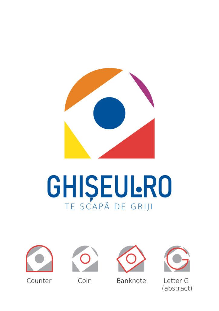
The new Logodesign for Ghișeul.ro brings a modern look to a service with history in Romania.
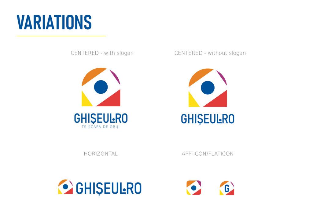
The simple, geometric and flat-design character aligns Ghișeul.ro brand with current design trends. At the same time it represents simplicity and efficiency in the use of the website and the future application.
The logomark is a combination of various elements, each representing objects related to the “payment at the counter” activity (counter, banknote, coin, etc.).
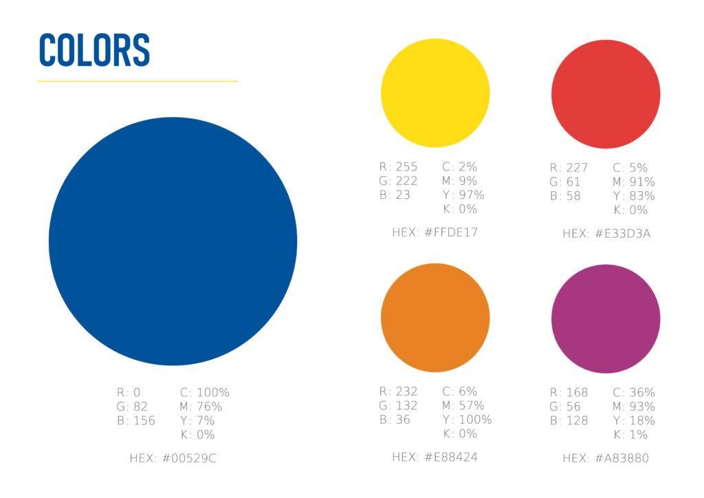
The colours chosen are those of the Romanian flag, plus lilac and orange, both obtained from
combination of two main colours (blue and red, respectively yellow and red).
The colours represent the different state institutions enrolled in the Ghișeul.ro platform.
The platform’s slogan “TE SCAPA DE GRIJI” (“It takes your mind off your worries”) uses DejaVu Sans – ExtraLight font. Its slim shape and spaced layout reflect the platform’s user-friendly nature and the benefits it brings.
The colours chosen are those of the Romanian flag, plus lilac and orange, both obtained from
combination of two main colours (blue and red, respectively yellow and red).
The colours represent the different state institutions enrolled in the Ghișeul.ro platform.
The Wordmark uses the Bahnschrift-SemiCondensed font.
With its straight, robust shape and chosen colour, the wordmark conveys reliability and security to users and is also easy to read.
The platform’s slogan “TE SCAPA DE GRIJI” (“It takes your mind off your worries”) uses DejaVu Sans – ExtraLight font. Its slim shape and spaced layout reflect the platform’s user-friendly nature and the benefits it brings.