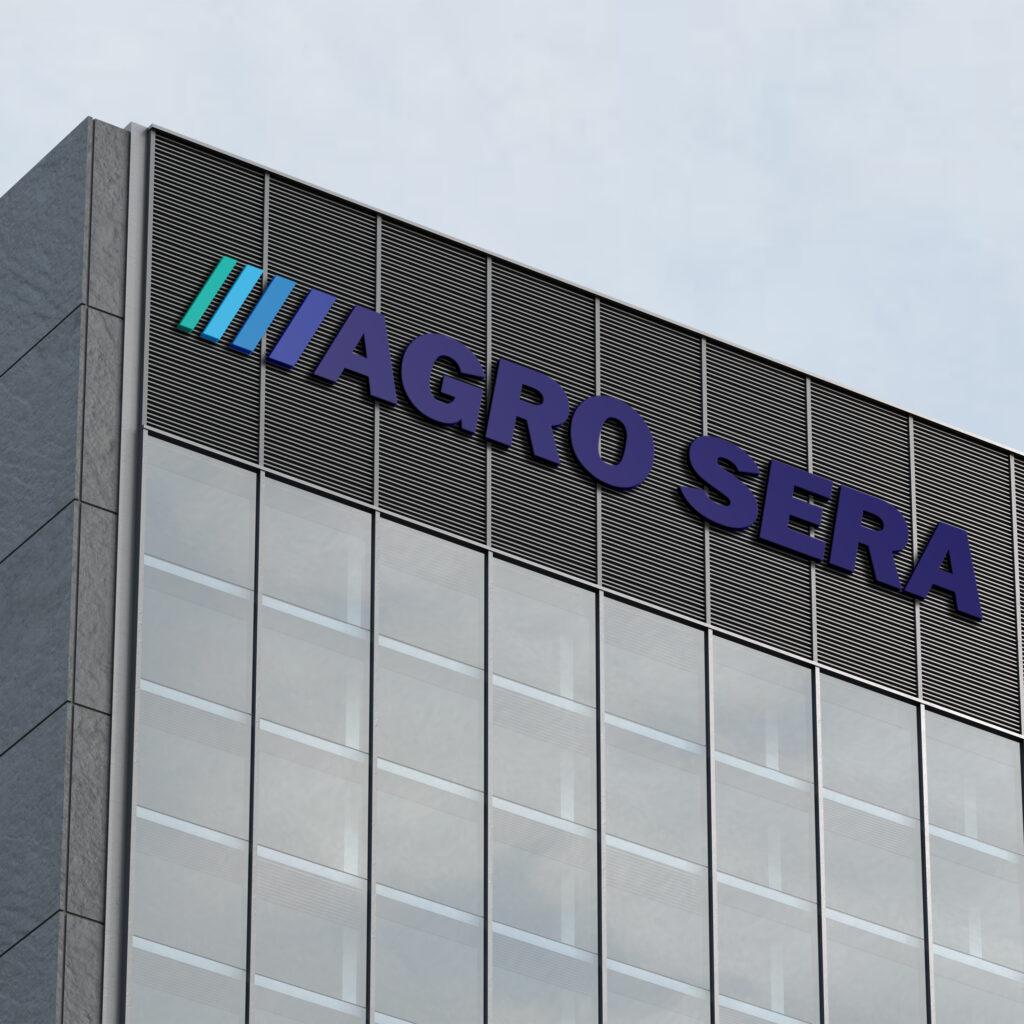
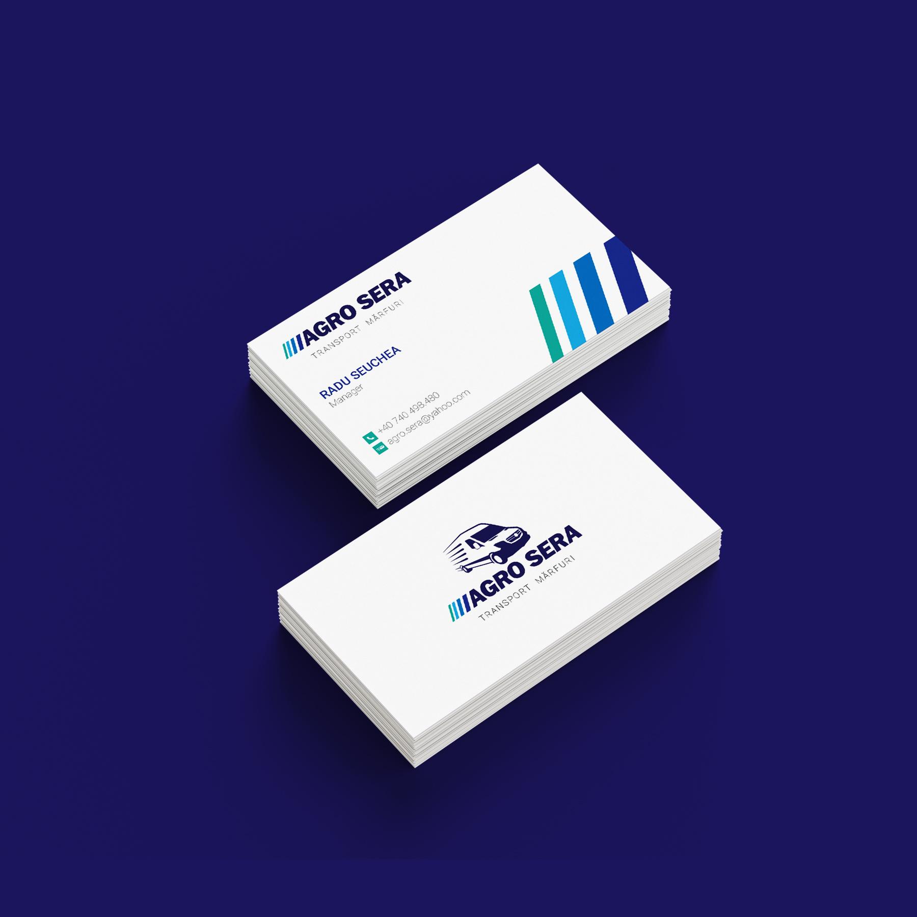
Agro Sera is a middle size logistics company based in Sibiu – Ro. As the company has changed and evolved, they needed a new logo design that better fitted the company’s direction.
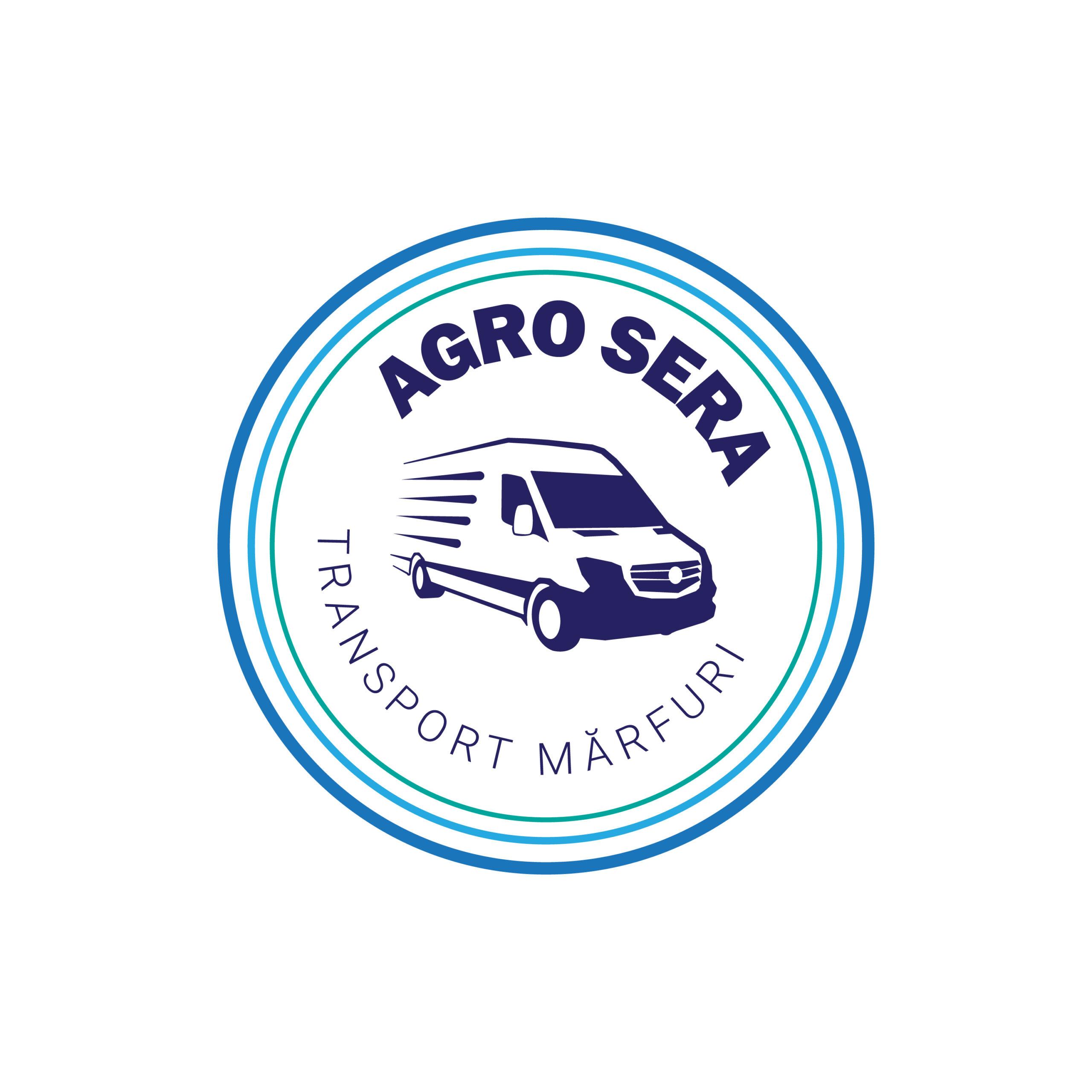
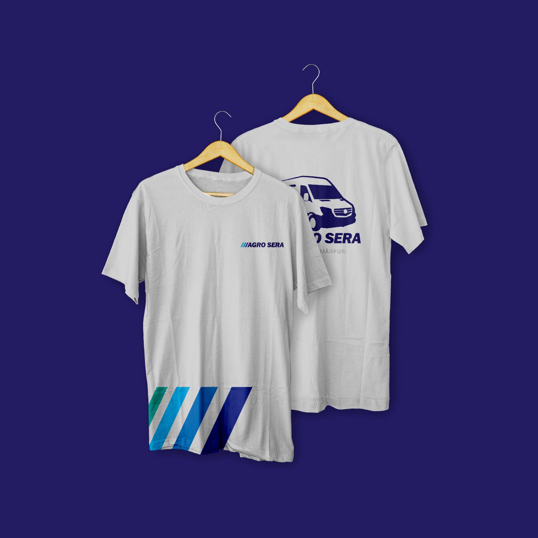
The logo is built on a skewed sans serif type plus 4 different colored lines, that together symbolize movement and speed. As Logo mark I used a stylized version of a van, of which the company’s fleet is comprised.
Logo variations are an important part of every brand identity. Having a versatile logo means everywhere you place it, it will look appropriate , will not be cut out but fit perfectly. With or without mark, tag line or not, squared or round , every company should have different forms of the same logo.
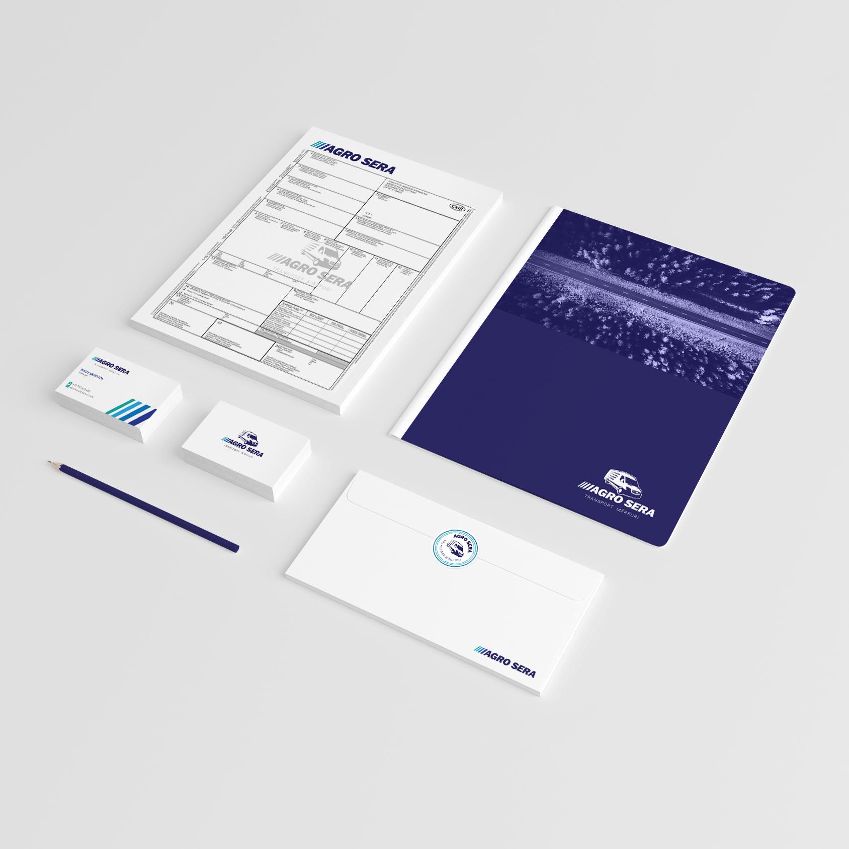
For a more comprehensive look, every Brand Identity should include assets. For Agro Sera this include the following, that go perfectly on stickers and social media or other places.
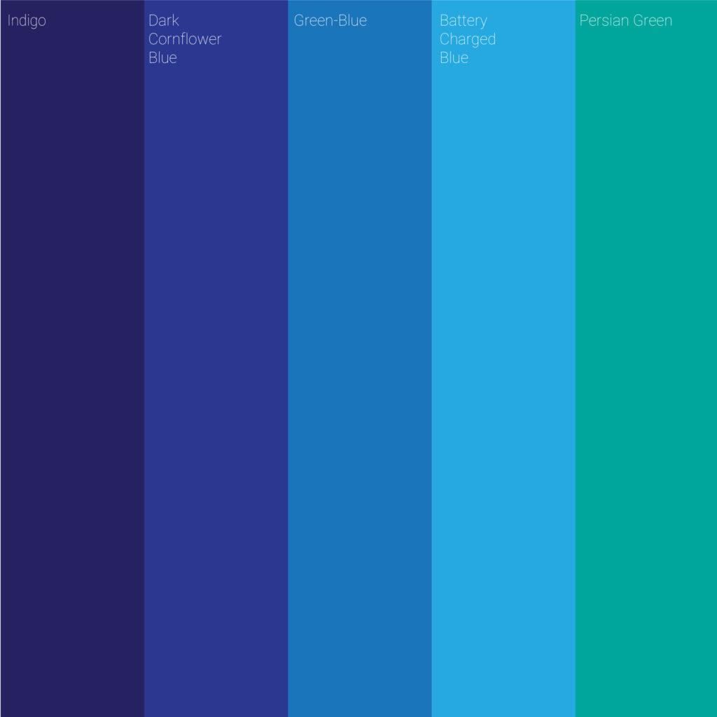
Choosing the right color and the right type for a brand is not an easy task. The new colors and fonts of Agro Sera give a feeling of seriousness, trust, speed and sustainability. As Indigo as a primary color the other blues as secondary and Persian Green as accent the Brand Image can be versatile and gives room to expand.